I’ve handled many presentation decks for various audiences and purposes throughout my career, ranging from project status reporting and product enhancement to kick-off meetings and training sessions. I’ve also seen many of my colleagues often make these common PowerPoint design mistakes, e.g., too much text, inconsistent styling and using irrelevant images. Getting your audience’s full attention is already tough enough, and having poor presentation deck is definitely not helping. So, in this post, I’ll share the top seven design mistakes and how to fix them with examples (no designer‑level skills needed!).
In a nutshell
- Cramming too much text
- Creating inconsistent design and styling
- Mixing up font types
- Using low-quality or irrelevant images
- Using too many images of varying styles
- Over animating the slides
- Weak visual hierarchy
- Start fixing your slides
1. Cramming too much text
This is the cardinal sin of any presentation deck and sits right at the top of my list! It’s common for people to treat a deck like documentation and load it with a lot of text because they worry about missing crucial details. But, the main point of having a presentation deck is to present condensed information with supporting visuals that help your audience process information quickly, not to create a Wikipedia entry that will turn their attention away!
How to fix this
Wherever possible, aim for one idea (or category) per slide. This way, you can keep text minimal by using short key phrases and still have ample space for relevant images to support your point. But if it’s mission impossible to present one idea on one slide, then split it into two (no need to call Ethan Hunt!). You can put detailed information in your speaker notes.
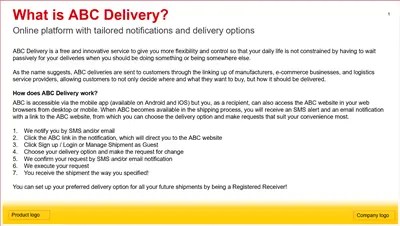
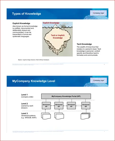
Case example: Too much text in the product introduction section
The problem
This wall of text will immediately put people off! There are indeed a lot of things you want to include in your introduction, i.e., what the product is, what are the main features and how it works. But overloading a single slide with text like this just won’t work!
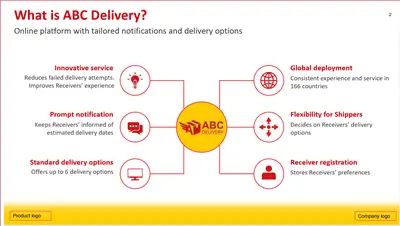
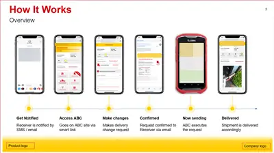
The solution
Split the content into two slides. The first explains what the product is and highlights the main features with relevant imagery. The second explains how it works with even stronger visuals to help the audience understand and see the flow. Since the goal is to promote the use of the product via mobile, use mobile mock-ups instead of desktop mock-ups. All this information still sits under the single category of product introduction.
2. Creating inconsistent design and styling
Slide one shows the client logo at the top-left corner but slide three shows it at the bottom-right. Slide six and eight have different footer formats. Throughout the deck, you see a mash of colours being used and some slides have way too much (or too little) empty space. All these inconsistencies make your deck look unprofessional and disorganised.
How to fix this
Use the Slide Master to set consistent colours and layouts, keep header styles identical across all slides, maintain the same spacing and alignment, and apply consistent formatting to similar elements (e.g., all statistics in red, all quotes in italics). If your company already has a template with defined style guide, then follow it. If you need to adjust it, apply those changes consistently everywhere. Don’t forget to save the updated Slide Master as a template so you can reuse it in future without reinventing the wheel each time.
Case example: Company logo, slide title and footer placement are not consistent
The problem
There are three issues in this example. First, the slide title has a different colour and position, i.e., slide one is white and left-aligned whereas slide two is black and centre-aligned. Second, the company logo appears at the top-right corner on slide one but appear at the top-left corner on slide two. Third, the footer is aligned to the left on slide one and it is almost centre-aligned on slide two.
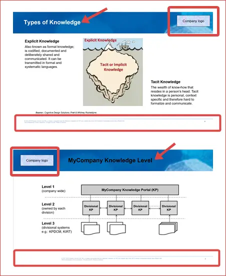
The solution
Update the layout of slide two so that it follows the layout in slide one via Slide Master. But, this method only works if slide two was initially created using a layout from the Slide Master. If someone copied and pasted it from another presentation deck, then you’ll need to manually correct it.
3. Mixing up font types
I’ve seen this way too often… a mix of font types either in the same slide or across multiple slides in a single presentation deck. If the font type is too decorative or the size is too small, it makes it hard to read especially for people sitting at the back. Using different font types throughout your presentation makes it look really amateurish and uninteresting!
How to fix this
There’s really no winner in which one is the best font style for a PowerPoint presentation, but you can certainly apply this “rule of thumb”: Use clean, sans-serif fonts (e.g., Calibri, Arial, Verdana). So if you decide to use Calibri, stick with it throughout the deck. If you paste the text from another source, double check that the pasted font matches your chosen font.
Case example: One slide contains three different font types
The problem
Three different font types are used in this slide, i.e., Bodoni MT Black for the title, STHupo for the first heading and Arial for the body text. The inconsistency is immediately obvious.

The solution
Use Arial for all to make it consistent. But, if your client or boss insists they want to have a distinctive title style to make it stand out more, well then, use at most two font types. No more than that!

4. Using low-quality or irrelevant images
I can’t stress enough how important it is to use high-quality images that are relevant to your topic, especially when you create a presentation for senior management or public events. Using irrelevant pictures or pixelated photos makes your presentation look super cheap (sorry not sorry!) and confuses people when the images don’t match the point you’re talking about.
How to fix this
Use high-resolution images that stay crisp on the big screens, keep the aspect ratios locked when resizing (so it doesn’t get terribly distorted) and choose images that reinforce the points on the slide. If your company doesn’t have an on-brand image repository, look for royalty-free pictures from reputable sites like Unsplash and Pixabay. NEVER. EVER. USE. IMAGES. WITH. WATERMARKS!
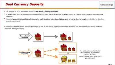
Case example: A pixelated photo with no relevance to the topic
The problem
The image has a very poor resolution. And that’s not the only problem. How is a group of people posing at sunset relevant to the dual currency deposits topic?! There’s absolutely no connection at all.

The solution
Replace the irrelevant photo with an illustration that helps the audience relate to the explanation of how dual currency deposits work (as shown below). Isn’t this a far better choice?
5. Using too many images of varying styles
When you use different image styles on one slide or on several slides under one idea/topic – real photos, comic illustration and 2D/3D icons – it will look like a random collection of mismatched assets. This visual fragmentation not only makes it look inconsistent, but also distracts the audience from your main message as they struggle to process the varying styles of images they see on screen.
How to fix this
Pick one specific image style for one slide or several slides under the same idea/topic. For example, if your product benefits section spans two slides, use the same style of 2D icons across them. You can of course, use a different image style for another idea/topic. Just don’t mix them all together under the same idea set.
Case example: Different image styles in the conclusion section
The problem
Three different image styles are used, i.e., a photo, an icon and an illustration. It doesn’t look good as it lacks something called “visual harmony”.
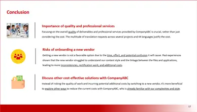
The solution
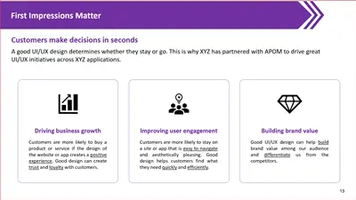
Choose one style and apply it consistently. If you use photos, use them for all three points. Same for icons or illustrations. In this example, simple 2D flat icons work well.

6. Over animating the slides
While some animations can help emphasise points or get your audience’s attention, using too many or unnecessary animations will distract them from your core message. Not only that, heavy animations can cause a lag, especially if you’re presenting via video calls with participants all over the world.
How to fix this
Use simple, subtle animation only if it genuinely helps. For example, choose “Fade” instead of “Spin” to reveal one point at a time as you explain. This keeps the audience focused on the current point and prevents them from reading ahead. A good use case is when you need to explain a step-by-step process.
Case example: Different animation effects in the key success factors section
The problem
The slide uses too many effects, i.e., “Fly In”, “Grow & Turn”, “Bounce”, “Pulse”, “Swivel”, “Compress” and “Spiral In”. While this might impress people who are unfamiliar with presentation tools, seasoned audiences will find it distracting. It’s best to avoid this approach.

The solution
Stick with one, simple animation effect, like “Fade”. You don’t need to animate the “Key Success Factors” block. It’s fine to show it up front, then reveal each factor one by one as you discuss them. This keeps your audience focused on the current point.

7. Weak visual hierarchy
If everything on your slide looks the same and equally important, e.g., same font size for titles and body text, then nothing stands out. Your audience won’t know which information matters most. They tend to read ahead and will eventually become disengaged from your presentation.
How to fix this
Use larger, bold font for headings to highlight the main idea. Use colour and weight to emphasise important numbers or key phrases, keep secondary information visually smaller and use white space to separate sections. These techniques will help you build a good visual structure to control the flow of attention and keep your audience engaged throughout.
Case example: All the text looks the same except for the slide title
The problem
You can’t immediately tell the difference between the subtitle and the supporting points. The other challenge is, all the content must stay on one slide and you can’t change it without the stakeholder’s permission!
The solution
Split the main text box into five separate text boxes. Colour the subtitle purple, bold it and place it right under the slide title. Reduce the font size for the remaining text, then colour and bold the key points to match. Finally, add relevant imagery and rearrange the body text as shown below. Now, isn’t this much easier to process?
This site has a very good explanation of visual hierarchy that you should check it out.
Start fixing your slides
I’m not an expert PowerPoint designer and you don’t have to be one either to fix these common design mistakes. Just start with a few simple changes first:
- Stick to one idea per slide. If you can’t, then spread the content across two or three slides.
- Keep layouts as clean as possible with ample white space, and ensure font types and colours are consistent throughout. Using Slide Master is your best bet for keeping everything consistent!
- Use relevant, high-quality images and pick one specific image style per slide, or maintain one style across a specific idea set.
- Keep animations to a minimum, and only use them if necessary (e.g., to guide the audience through a step-by-step process).
With constant practice, you’ll soon get the hang of it. Your slides don’t need to be perfect, but they do need to be clear, readable and professional. By proactively avoiding these common PowerPoint design mistakes, you’ll significantly improve the quality and effectiveness of your presentations. If you need more ideas, you can always take inspiration from other examples on the internet (or browse the PowerPoint posts on my blog!) ;) Check out this post for creative ways to create a bulleted list.
Find this post useful in your work? Please share it with your colleagues and friends! Got a problem (or two) that you can’t seem to solve, or need advice tackling your PowerPoint design woes? Drop me a message via LinkedIn!
PS: Most samples shown here are based on my real-world projects, so I’ve edited all sensitive information.


